If your worship visuals change every week, your church doesn’t have a “style” — it has a collection of decisions.
Many churches assume consistency requires a designer, a brand book, or hours in Photoshop. In reality, most inconsistency comes from too many options and no defaults. Different volunteers make different choices, and the look shifts week to week.
This guide shows how to build a calm, modern, consistent worship look using motion backgrounds — without designing anything from scratch, and without turning volunteers into creatives.


What “consistent” actually means in worship visuals
Consistency doesn’t mean every song looks identical. It means the visuals feel related. The same pace of motion. A similar colour mood. A predictable level of contrast. When those things line up, the service feels intentional — even if the songs are different.
Inconsistent visuals usually aren’t caused by “bad taste.” They’re caused by too much choice and no system.
The mistake: trying to design instead of standardise
Many teams try to solve inconsistency by creating new graphics every week. That adds pressure, slows prep, and makes volunteers feel like they’re doing something “wrong” if it doesn’t look perfect.
The better approach is to standardise a small set of visual building blocks — especially motion backgrounds — and reuse them intentionally.
A simple system that creates consistency automatically
You don’t need a brand guide. You need three things: a default, a few alternates, and rules everyone follows.
1) Choose one default worship background
Pick one motion background that works for most songs. Slow movement. Soft texture. Stable contrast. This becomes the “home base” look. If nothing else is chosen, this is what gets used.
2) Add a small set of alternates (not endless options)
Choose a handful of additional backgrounds that match the same motion speed and texture style, but vary slightly in colour or mood. Think reflective, neutral, celebratory — not “everything we own.”
3) Lock simple rules for everyone
Consistency comes from rules, not talent. Your rules can be short:
- One background per song
- Slow motion only under lyrics
- No switching unless there’s a clear reason
“Consistency doesn’t come from better designers. It comes from fewer decisions and clearer defaults.”
Common mistakes that break consistency
If your visuals feel scattered, it’s usually because of one of these:
- Too many background options in rotation
- Different volunteers choosing based on personal taste
- Switching looks mid-song to “keep it interesting”
- Using motion designed for hype moments under lyrics
- No default when someone isn’t sure what to pick
Quick wins you can apply this week
You don’t need a reset. You need simplification.
- Pick one default motion background today.
- Remove half your current options from volunteer view.
- Stop switching backgrounds mid-song.
- Write three simple visual rules and share them.
- Test your default from the back of the room.
What “great” looks like
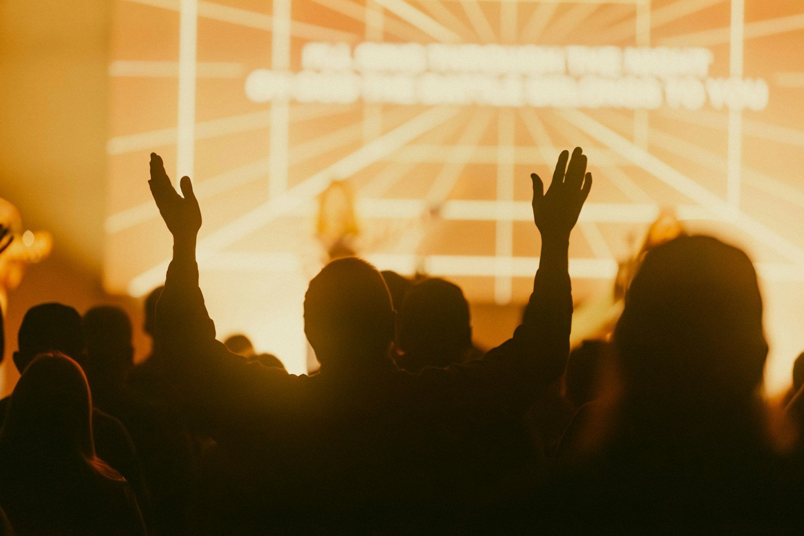
Great worship visuals feel calm, predictable, and intentional. The service has a visual identity without anyone having to think about it. Volunteers feel confident. The room feels settled. And the lyrics lead every moment.
The easiest way to get there is to build your defaults from a curated set of worship motion backgrounds that already share the same visual language. That’s how churches create a “look” without ever opening a design app.