

Textured worship backgrounds can make a church screen feel intentional before anyone says a word. The right background gives the room atmosphere, helps a service feel visually coherent, and creates a better environment for lyrics, scripture, and spoken moments.
The mistake is treating the background as the main event. In worship, the screen is not there to impress people with motion. It is there to support what the congregation is singing, reading, and responding to. That means every visual choice has to be judged by clarity as much as style.
This guide explains how to use textured worship backgrounds in a way that feels designed, practical, and volunteer-friendly without sacrificing lyric readability.

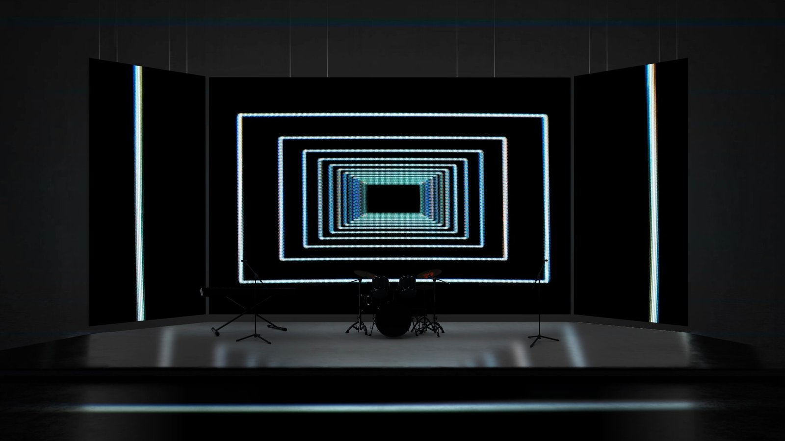
Why this style works on church screens
The strength of textured worship backgrounds is depth, tactility, and a more cinematic surface than a flat colour field. That gives media teams a way to create atmosphere without relying on literal imagery or busy stage graphics. It can help the screen feel alive while still leaving room for the service content to lead.
For church leaders, that balance matters. A background that is too plain can make the room feel unfinished. A background that is too active can make the room feel visually noisy. The best motion sits between those extremes. It gives the service a visual tone, but it does not ask the congregation to look at it for its own sake.
Where it can fail
The main risk is simple: grain, noise, and heavy texture can reduce lyric clarity if the foreground is not protected. A background can look excellent in a preview window and still perform badly behind real lyrics. Preview images usually show the motion by itself. Sunday morning never does. The background is sharing space with text, timers, sermon notes, camera exposure, stage lighting, and the attention span of the room.
If a worship leader has to ask whether the lyrics are readable, the answer is probably no. Screen clarity should feel effortless. People should be able to glance up, catch the words, and keep singing without mentally separating text from image.
Start with the lyric zone
Before choosing any motion background, identify where your lyrics normally sit. Some churches centre text. Others keep it lower third. Some use four-line lyric blocks; others use larger two-line slides. The safest background is the one that gives that specific lyric zone enough visual quiet.
That does not always mean choosing the darkest background. It means choosing one with controlled contrast in the place where text appears. White lyrics need darker or more muted space behind them. Dark lyrics need a lighter but even surface. If the brightest or busiest part of the loop sits directly behind the words, the congregation will feel it even if they cannot name the problem.
Control movement speed
Motion speed shapes the emotional feel of a service. Slow movement creates steadiness. Medium movement creates lift. Fast movement creates energy, but also fatigue. For lyric backgrounds, slower is usually safer than the preview suggests.
Run the loop for at least a minute with real lyrics on top. Watch whether your eye starts following the background instead of reading the text. If the motion keeps pulling your attention, use it for walk-in, transitions, or instrumental moments rather than congregational singing.
Think differently for projector, LED wall, and livestream
“Texture gives a screen depth, but restraint keeps it from becoming visual noise.”
Projection often reduces contrast. A background that looks rich on a laptop can turn grey and low-impact on a large projector, especially in a bright room. If your church uses projection, favour backgrounds with clear tonal separation and avoid anything too pale behind white text.
LED walls hold brightness and saturation much more aggressively. What looks refined on a monitor can feel intense at stage scale. Lowering brightness, choosing slower motion, and avoiding extreme highlights usually helps the background sit behind the lyrics rather than pushing forward.
Livestream is a separate test. Cameras and encoders compress movement and gradients, and viewers may be watching on a phone. Always check the actual stream output if the service is broadcast. A background is not truly lyric-safe until it works for the room and the camera.
Where to use it in a service
This style is especially useful for reflective worship, sermon slides, pre-service atmosphere, and churches that want a mature screen language. It can help connect separate parts of the service so the screen does not feel like a random sequence of media choices.
That does not mean using the same visual everywhere. A good service plan has contrast. Use stronger motion where the energy calls for it, calmer motion where people need to focus, and simpler backgrounds when the screen carries more text. The discipline is choosing the visual that serves the moment, not the one that looks most impressive in isolation.
A practical volunteer check
Before Sunday, load the background into the same presentation software your team uses live. Add your normal lyric style, not a demo slide. Test the longest lyric line, the brightest part of the loop, and the screen from the back of the room. If your church streams, check the encoded stream on a phone as well.
Give volunteers clear labels. Mark a loop as lyric-safe, instrumental only, walk-in, prayer, or high-energy. That turns design judgement into an operating system volunteers can trust under pressure.
The standard to aim for
The best church motion backgrounds are not the ones people talk about after the service. They are the ones that make the service feel visually coherent while keeping the words clear and the room focused.
Use textured worship backgrounds with restraint, test it in the real environment, and protect the lyric zone first. When the background supports the room without drawing attention to itself, it is doing its job.
For more lyric-safe worship visuals, browse the Church Visuals collection of motion backgrounds for churches.
