
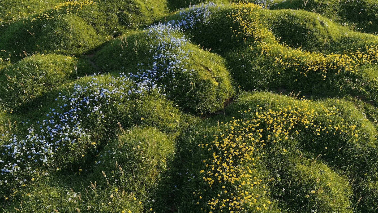
Nature-based motion backgrounds can do something abstract visuals often cannot: they make a worship space feel grounded. A field moving gently in the wind, soft cloud movement, water catching light, or a warm horizon can bring a sense of creation into the room without needing a literal scene on every slide.
That usefulness comes with a real production challenge. Natural imagery contains detail. Grass has texture. Clouds shift in brightness. Water reflects highlights. Tree lines create edges. If those details sit behind song lyrics without enough control, the background starts competing with the words the congregation is trying to sing.
The goal is not to avoid nature visuals. The goal is to use them with enough design discipline that they support the service rather than becoming the thing people notice.


Why nature visuals work so well in worship contexts
Churches often reach for nature imagery because it feels human before it feels designed. A natural landscape carries emotional warmth without needing explanation. It can suggest stillness, renewal, creation, breath, harvest, wilderness, rest, or hope depending on the image and the moment in the service.
That makes nature-based backgrounds particularly useful for worship leaders and media teams who want a screen environment that feels less like a graphic package and more like an atmosphere. A meadow loop can soften a room before prayer. A slow sky background can make a reflective song feel more spacious. Water movement can connect naturally to baptism, renewal, or cleansing language without needing heavy visual symbolism.
The strength of nature imagery is that people already know how to read it. Nobody needs to decode a field, cloud, horizon, or shoreline. The visual language is accessible across age groups, church styles, and production levels. For volunteer-led churches, that accessibility matters. The background can feel considered without requiring a design team to explain it.
Where nature backgrounds start to fail
The same qualities that make nature visuals rich can also make them risky. A background with too much sharp detail creates visual noise behind lyrics. A bright sky through the centre of frame can swallow white text. Fast-moving leaves or grass can make the screen feel restless. A natural scene with obvious objects or strong horizon lines can pull attention away from the foreground.
This is the difference between a worship background and a beautiful clip of nature footage. A beautiful clip can be full of detail, contrast, and subject matter. A worship background has to make room for lyrics, scripture, lower thirds, and the actual focus of the service. It should hold atmosphere while allowing the foreground content to remain effortless to read.
When assessing a nature-based background, do not only ask whether it looks good in preview. Ask whether it still works once your real lyric template is placed over it. The answer may be different.
Lyric clarity starts with contrast
For most churches, lyric readability is the first test. If people have to work to read the words, the background is not serving the room. White lyrics over a pale sky, yellow field, or bright cloud bank will usually struggle. Dark lyrics over a shadowed forest or night landscape will struggle in the opposite direction.
The safest nature backgrounds for lyrics are usually mid-to-dark overall, with controlled highlights and no bright detail directly behind the text zone. A darker meadow, a muted green field, a soft blue sky with the brightest area away from centre, or a warm horizon with enough shadow can all work well. What matters is not the subject, but the contrast relationship between the subject and the lyric area.
Test the actual slide style your church uses. Use your real font, size, weight, line spacing, and text shadow. A background that looks clear with a large demo lyric may not hold up with four lines of smaller text from your real service file.
Movement speed should feel almost slower than you expect
Nature movement is easy to overdo. Wind through grass, rippling water, drifting clouds, and light leaks all feel peaceful in isolation, but they can become visually busy when repeated behind lyrics for a full worship set.
For congregational singing, slower movement is usually better. The motion should be present enough to keep the screen alive, but not so active that the eye tracks individual objects. If people can follow the movement of a single blade of grass, wave, branch, or cloud edge, the background may be too specific for lyric use.
A good rule for volunteers is simple: clear the lyrics for ten seconds and watch the background, then bring the lyrics back. If the background suddenly feels like it is fighting the words, choose a calmer loop or darken it before the service.
Projection, LED walls, and livestreams behave differently
A nature background will not look identical on every output. Projectors tend to reduce contrast and lift blacks, especially in rooms with ambient light. A background that looks rich on a laptop may appear washed out on a large projection screen. In that environment, choose nature visuals with stronger separation between the lyric zone and the image behind it, and avoid very pale backgrounds for white text.
LED walls create the opposite problem. They hold colour and brightness aggressively. Greens can look more saturated, highlights can feel harsher, and detailed texture can become more dominant than expected. If your church uses an LED wall, favour nature visuals with restrained colour, slower motion, and less fine detail. Lower brightness often helps the background sit behind the lyrics rather than pushing forward.
“The best nature background feels like part of the room. It creates atmosphere without making lyrics harder to read.”
Livestream adds another layer. Cameras and encoders compress movement, gradients, and detail. Fine grass texture or fast water movement can become noisy on a phone screen, even if it looks beautiful in the room. Always check the stream output, not just the screen output. Pull up the live or test stream on a phone and verify that lyrics remain clear at the size people actually watch.
When to use nature-based backgrounds in a service
Nature visuals work best when the service moment benefits from warmth, breath, or grounded atmosphere. They are strong for reflective worship, prayer, creation-themed teaching, harvest or autumn series, baptism services, summer gatherings, outdoor-feeling sermon series, and moments where the room needs to feel calm rather than intense.
They are not always the right choice for every song. A high-energy opener may need a bolder abstract or light-based background. A dramatic sermon moment may call for something darker and more cinematic. A very text-heavy teaching slide may be better on a simple gradient or static dark background. Good media direction is not about using one visual style everywhere; it is about choosing what the moment can carry.
If you are building a service plan, place nature backgrounds where they help the congregation settle, breathe, or focus. Use them intentionally rather than as a default.
How to choose colour and brightness
Colour temperature shapes how a nature background feels. Warm gold and green tones feel pastoral, grounded, and welcoming. Cooler blue skies or water loops feel spacious and calm. Darker forest or evening tones can feel contemplative, but they need careful lyric contrast and enough visual softness to avoid looking heavy.
Brightness should be chosen around the foreground, not around the background. If your lyrics are white, the background should give them room. That may mean choosing a darker version, lowering opacity, adding a subtle dark overlay in your presentation software, or moving the lyric block away from the brightest part of the frame.
Do not assume the most beautiful background preview is the best worship background. The right choice is often the one that looks slightly quieter on its own and much better once text is on top.
Volunteer-friendly checks before Sunday
A simple pre-service check can prevent most lyric clarity problems. First, load the exact background into ProPresenter, EasyWorship, MediaShout, or your normal presentation system. Second, apply your normal lyric template. Third, test the brightest lyric slide and the longest lyric slide, not just a clean two-line example.
Then stand where the congregation stands. Look from the back of the room, not just from the tech desk. If your church streams, check the encoded stream on a phone. If the text is readable in those conditions, the background is probably safe. If you are unsure, choose the calmer option. Nobody complains that the lyrics were too easy to read.
It also helps to keep a small set of proven nature loops in a clearly named folder. Volunteers should not have to make creative decisions under pressure. If a loop is lyric-safe, label it accordingly. If it only works for instrumental moments or walk-in slides, label that too.
Using Living Field without turning the article into a product pitch
A pack like Living Field sits in the useful middle ground for this kind of service planning. Its natural meadow texture can bring warmth and calm to the screen, but it still needs to be used with the same checks as any other nature-based visual: lyric contrast, movement speed, brightness, and screen type.
The point is not that one pack solves every situation. The point is that nature-based visuals become powerful when they are selected and operated with care. Living Field may be a good fit for reflective worship, creation themes, summer or harvest moments, and calm service transitions, especially where the church wants something organic rather than abstract.
The standard to aim for
The best nature-based church motion backgrounds feel like part of the room. They create atmosphere without asking for attention. They give the service a visual environment, but they never make the congregation fight to read lyrics or follow scripture.
That standard is practical, not mysterious. Choose slower movement. Protect the lyric zone. Test on the real screen. Check the livestream. Give volunteers clear options. Use nature visuals where their warmth and accessibility actually serve the moment.
If you want to build a calmer, more readable worship screen library, browse the Church Visuals collection of nature, atmosphere, and worship motion backgrounds.
