
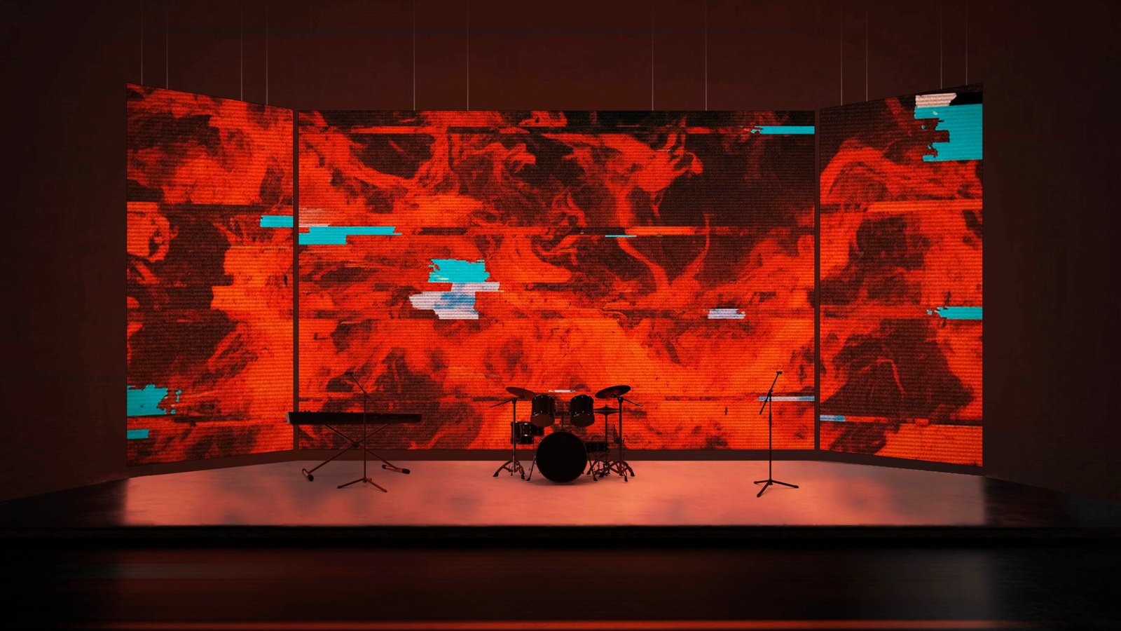
Most church stages don’t look dated because of the building or the budget. They look dated because of the content choices — specifically, the motion backgrounds that haven’t been updated since 2017, the looping countdown that came with the software, and the stock imagery that thousands of other churches are using.
The good news: this is the most fixable problem in church production. Here’s what to look for and what to change.


Sign 1: The Looping Countdown
If your pre-service countdown uses the stock animation that came with ProPresenter or EasyWorship — the one every other church in your denomination is also using — it’s working against you. It’s the visual equivalent of playing hold music. Visitors notice it immediately as a marker of ‘default church.’
Fix it: Replace the stock countdown with one of your motion backgrounds set to loop while a custom text overlay counts down. Five minutes of work, permanent improvement.
Sign 2: Static Background Images
A stage running a static image behind lyrics — even a beautiful photograph — looks frozen in 2015. Modern worship production has moved decisively toward subtle motion, and static images now read as an absence of effort rather than a stylistic choice.
Fix it: Swap one background at a time. Start with your most-used lyric background. Replace it with a slow atmospheric motion background at low brightness. The difference in how the room feels will be immediate.
Sign 3: Oversaturated Stock Footage
Heavily colour-graded stock footage — the kind with extremely vivid purple clouds or orange lens flares from 2012 — reads as cheap and generic, even in high resolution. The aesthetic language of modern worship production has moved toward either photorealistic naturalism (actual sky, actual water) or clean abstraction (light, colour, geometry).
“Churches that look dated aren’t lacking effort — they’re lacking intention.”
Fix it: Audit your current library. Remove anything with obvious lens flares, heavy vignetting, or HDR-era colour grading. Replace with packs designed specifically for contemporary worship.
Sign 4: Mismatched Backgrounds Across the Service
A service that uses a bright floral background for the opening song, switches to a dark space nebula for the next song, then cuts to a clean white gradient for the sermon looks visually incoherent — even if each individual background is high quality.
Fix it: Choose backgrounds for the whole service from within one or two packs. A pack is a curated visual family — using three or four loops from the same pack keeps the service visually cohesive without requiring the congregation to consciously notice.
Sign 5: Text That Can’t Be Read
White text on a bright background. Dark text on a dark background. Lyrics that disappear mid-song because the background cycled to a bright phase. These are the most common and most damaging visual failures in live worship.
Fix it: Every background in your live library should be tested with your lyric template before it goes into a service. Set a rule: if the words aren’t immediately legible from the back row, the background doesn’t go in the service.
The Honest Truth
Visitors to your church form an impression of your community within the first few minutes of arrival — often before anyone has spoken to them. Your stage is doing a lot of that work. It doesn’t need to be expensive or elaborate. It needs to look considered. That starts with the content you’re putting on your screens.
