If your worship visuals feel “off” but you can’t quite explain why — it’s probably one of these five mistakes.
Most churches don’t have bad intentions with visuals. They have good hearts, decent gear, and volunteers doing their best. But a handful of predictable mistakes quietly undermine lyric clarity, atmosphere, and confidence in the room.
The good news? These mistakes are easy to fix — often in under ten minutes. This guide walks through the five most common visual issues churches make during worship, why they happen, and what to change immediately.


Mistake #1: Choosing backgrounds based on “cool,” not readability
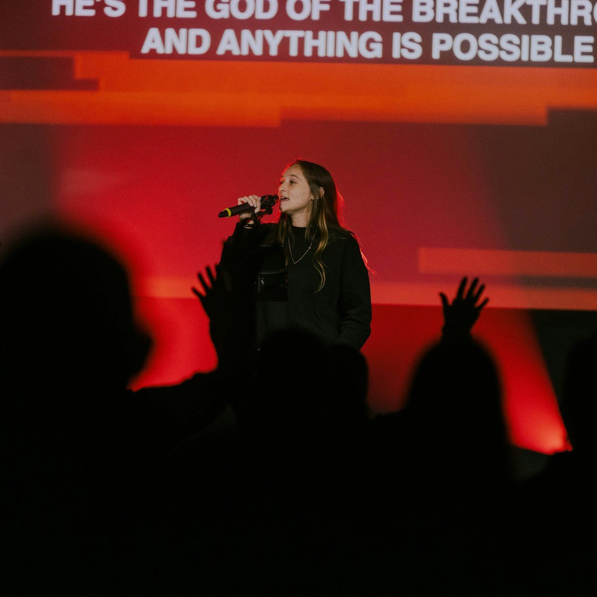
This is the most common mistake by far. A background looks great on a preview thumbnail, so it gets used everywhere. But in a live room, busy textures, sharp detail, and fast motion make lyrics harder to read — especially from the back.
Fix: Prioritise slow motion, soft texture, and stable contrast. If the background draws attention to itself, it doesn’t belong under lyrics.
Mistake #2: Switching backgrounds mid-song
Switching backgrounds to “add interest” usually does the opposite. It breaks focus, resets the room visually, and makes the worship set feel unsettled. Even subtle changes are felt more than people realise.
Fix: Use one background per song. Consistency feels intentional. Variety feels accidental.
Mistake #3: Motion that’s too fast for worship
Fast or rhythmic motion competes directly with reading. On LED walls especially, movement that feels fine on a laptop can feel overwhelming at scale. The room starts following the motion instead of the words.
Fix: Reserve fast motion for transitions. For lyrics, use slow ambient loops that don’t have a visual “beat.”
“If your visuals need to be noticed to work, they’re already working against worship.”
Mistake #4: Not testing visuals in the room
The booth lies. A background that looks fine on a monitor can fail badly once it’s projected or displayed on LED. Distance, lighting, and screen brightness all change how readable lyrics feel.
Fix: Stand where the congregation stands. If you can’t read instantly, change it.
Mistake #5: Letting Sunday be decision day
Last-minute decisions are rarely good ones. When volunteers are choosing backgrounds under time pressure, consistency disappears and stress rises — even if nobody says it out loud.
Fix: Choose backgrounds during prep, not rehearsal. Lock them early so Sunday runs calmly.
Quick wins you can fix in 10 minutes
If you want immediate improvement before the next service, do these:
- Use one background per song.
- Remove any fast or busy motion from lyric slides.
- Lower background brightness slightly if the screen feels harsh.
- Test readability from the back of the room.
- Lock your visuals before volunteers arrive.
What “great” looks like
Great worship visuals don’t shout. They don’t change constantly. They don’t draw attention to themselves. They create a calm, consistent environment where lyrics are clear and the room can focus on worship.
If you want to make this easier long-term, start with a small, curated set of worship motion backgrounds that are designed specifically for lyrics. That’s how teams move from “doing their best” to looking intentional every week.