Static slides aren’t “more spiritual.” And motion backgrounds aren’t automatically distracting. The difference is whether your visuals serve the room — or steal attention from it.
This debate gets messy because people argue taste: “motion feels like a concert,” or “static feels dated.” But the real issue isn’t style. It’s function. Worship visuals have a job to do: keep lyrics clear, support atmosphere, and help the room stay engaged without visual noise.
In this guide, you’ll learn when motion backgrounds genuinely help (and make worship feel more intentional), when static slides are actually the smarter choice, and how to avoid the common mistakes that make visuals feel distracting or “try-hard.”


What you’re actually choosing: attention management
This isn’t a “motion vs static” argument. It’s a question of where the attention goes. Worship visuals are either doing one of two things: they’re quietly supporting the lyrics and mood, or they’re competing with the moment and fragmenting focus.
Motion can make worship feel modern, warm, and intentional — but only when it’s restrained. Static can feel clean, confident, and undistracting — but only when it’s designed well and doesn’t look like a default template.
When motion backgrounds help (and actually improve worship)
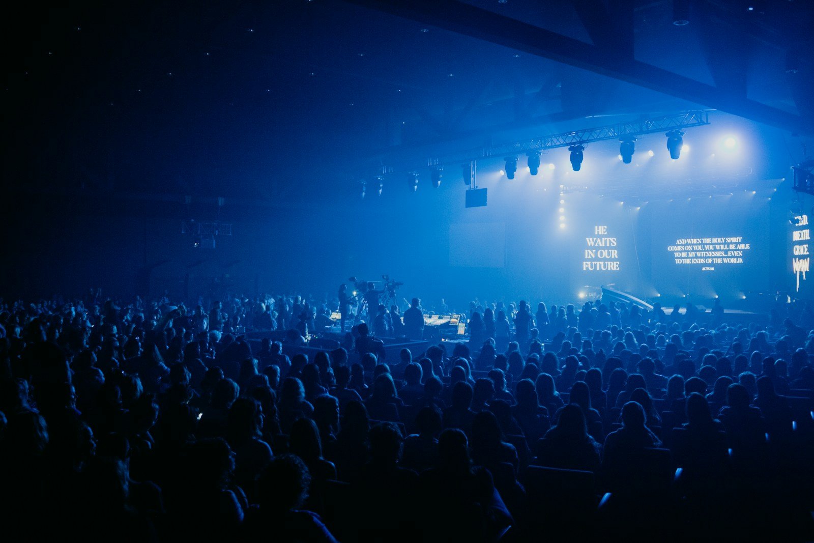
Motion helps when it does what static can’t: it adds a gentle sense of atmosphere and movement that makes the screen feel alive without “performing.” In modern church aesthetics, that subtle motion can make your whole visual environment feel more premium, even if the rest of your setup is simple.
Motion backgrounds tend to work best when:
- the movement is slow (so eyes stay on lyrics, not animation)
- the texture is soft (no sharp detail behind text)
- the contrast is stable (no light flares behind the lyric block)
- the set feels consistent (one background per song is usually enough)
If you want a simple rule: motion should feel like breathing, not dancing.
When static slides are the smarter choice
Static is underrated — especially for churches with unpredictable lighting, smaller projection setups, or volunteer teams that need zero moving parts on Sunday morning. A well-designed static background can feel calm and confident, and it removes an entire category of “visual distraction” risk.
Static is usually the better choice when:
- your projector struggles with contrast or the room is bright
- your motion options are generic, fast, or busy
- you’re in a quieter moment where stillness supports the room
- volunteers are rotating often and need consistency
Static doesn’t have to look “old.” It just has to be intentional: good spacing, calm colour, and no visual clutter behind the lyrics.
A simple workflow: how to decide what to use for each song
If your team argues about visuals, it’s usually because there’s no shared decision system. Use this quick workflow for each song in a set. It keeps the conversation practical and stops the “taste battle.”
Step 1: Decide the moment. Is the song meant to feel reflective, intimate, celebratory, or transitional?
Step 2: Pick the safest readable option first (static or slow motion).
Step 3: Test from the back of the room. If you can’t read instantly, it fails.
Step 4: Lock it. Don’t swap backgrounds mid-song unless you have a very clear reason.
Step 5: Keep the set coherent. A consistent visual “language” beats variety every time.
“The best worship visuals don’t win attention. They manage it. If your background is the most interesting thing on screen, the room loses the words.”
Common mistakes that make motion feel “too much”
Motion usually gets blamed when the real culprit is how it’s being used. Here are the mistakes that turn motion into distraction and make people wish you’d stayed static.
- Fast movement under lyrics — anything that feels rhythmic competes with reading.
- Busy texture behind text — detail and patterns create shimmer and visual noise.
- Contrast that changes mid-loop — bright patches behind words kill clarity.
- Switching looks constantly — variety feels like chaos, not creativity.
- Choosing for the booth, not the room — always test from the back.
Quick wins in 10 minutes (especially for volunteers)
If you’ve got a service coming up and your visuals feel distracting, these quick fixes are the fastest way back to clarity — without redesigning anything.
- Choose one background per song (don’t “DJ” the visuals).
- If motion is distracting, swap it for a slower loop or go static for that moment.
- Reduce background brightness slightly so the lyric block stays dominant.
- Stand at the back of the room and check readability in real lighting.
- Lock the set early so nobody is choosing visuals under pressure.
What great looks like (modern, minimal, and calm)
In the best modern church environments, visuals feel cohesive. Motion is present, but restrained. Colour is controlled. The screen supports the room instead of trying to become the room. It feels premium because it’s disciplined — not because it’s flashy.
If you want a practical next step, don’t chase “more.” Chase consistency. Pick a small set of backgrounds that are readable and use them confidently. If you need a curated starting point (motion only — no slides), Church Visuals is built specifically for that: explore motion backgrounds.
Where Church Visuals fits (without overcomplicating your Sunday)
Big libraries give you endless options — which sounds helpful until you’re picking visuals five minutes before rehearsal. Curation is what makes motion usable. Church Visuals focuses only on premium worship motion loops that are designed to sit behind lyrics with slow movement, controlled texture, and stable contrast. That means less guessing and more consistency for your team.
If you want to simplify your setup, start here: see the subscription or test a loop first: grab a free sample.