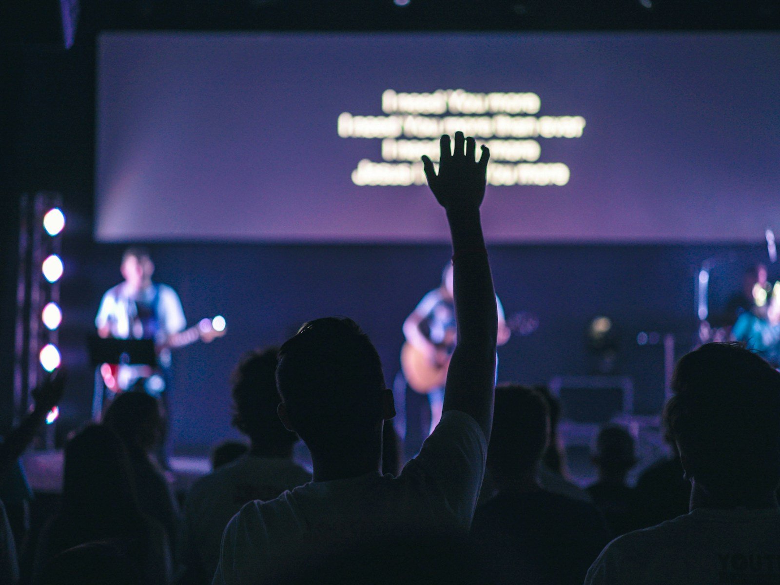
If people are squinting at the screen during worship, something’s wrong — and it’s probably not your font.
Most lyric readability problems come down to motion backgrounds that look great on a website but fall apart in a live room. The movement is too active. The texture is too busy. The contrast shifts behind the words. And when that happens, the congregation doesn’t just “notice the visuals” — they stop reading confidently.
This guide shows you how to choose worship motion backgrounds that serve the lyrics instead of fighting them — in a way that works for real Sundays, real volunteers, and real rooms (projector or LED wall).
The real job of a worship motion background
A worship motion background has one primary job: support the lyrics without drawing attention to itself. That’s it. Not “look impressive.” Not “fill the screen.” Not “add energy.” The background should create atmosphere while the words lead the room.
If your background becomes the most interesting thing on the screen, it’s already failed. People shouldn’t be tracking your visuals — they should be singing.
The 5 readability rules that matter more than style
Most churches choose motion backgrounds based on vibe first. That’s backwards. Choose for function first (readability), then pick the style that fits your church. Here are the rules that actually make lyrics readable.
1) Motion speed matters more than motion style
Readability drops fastest when the background movement feels like it has a beat of its own. Even “beautiful” motion becomes distracting if it’s too fast or too directional. Your eyes start following the movement instead of reading words — especially in the back third of the room.
What usually works best is slow, ambient motion with long transitions. Think gentle drift, soft gradients, subtle light movement, and loops that don’t “restart” obviously.
2) Texture density is the silent killer
This is the mistake people miss. You can pick a slow loop and still ruin readability if the texture is busy. Detailed textures create visual noise behind text, and that noise gets worse on projectors, streams, and any screen with imperfect calibration.
As a quick rule: if you can clearly see “stuff” behind the words (sharp edges, patterns, repeated shapes), the lyrics will fight for attention. Softer, more defocused textures are almost always safer.
3) Contrast must be predictable, not just “high”
A common trap is thinking “white text + dark background = solved.” But contrast fails when brightness behind the words changes over time. If your background drifts from dark to mid-grey to bright and back again, the lyrics will look clean on one line and messy on the next.
What you want is stable contrast: backgrounds that stay within a narrow brightness range and don’t throw highlights directly behind the lyric block.
4) Colour choice affects fatigue across a full set
Super-saturated colours look exciting for ten seconds. Over a whole worship set, they can fatigue eyes and overpower quieter moments. Modern, minimal worship aesthetics usually feel “premium” because the palette is controlled: neutrals, muted tones, and intentional accents rather than constant colour fireworks.
This isn’t about being boring — it’s about making something that works in a room full of people who are trying to focus and sing.
5) The best backgrounds disappear
Here’s the simplest test: if you mute the audio and the background still pulls your attention, it’s too strong. Great worship motion backgrounds feel almost invisible — until you turn them off. Then you realise how much atmosphere they were quietly carrying.
A simple framework for choosing the right background
When you’re scanning a library quickly, taste isn’t enough. You need a filter that works under pressure. Use this framework to decide in seconds whether a background earns a place in your set.
The LEAD test
Lyrics come first. Eyes rest easily. Ambience supports the moment. Doesn’t demand attention.
If a background fails even one of those, don’t force it. The room will feel the distraction even if nobody can name what’s wrong.
This is also why curation matters. Church Visuals focuses only on worship motion backgrounds and loops built for live lyrics — not generic visuals repackaged for church use. If you want a quick reference point for what “readable” actually looks like, browse a curated set here: worship motion backgrounds.
”If you can “feel” the background moving, it’s probably too much for lyrics. Slow it down, simplify it, or swap it.”
Common mistakes churches make (the real ones)
Most visual issues aren’t gear issues. They’re selection and consistency issues. These are the patterns that show up again and again when lyrics feel hard to read.
- Using “hype” motion under every song — energetic loops that never let the room breathe.
- Switching backgrounds mid-song to keep things “fresh” — it breaks focus faster than you think.
- Trying to fix bad backgrounds with overlays — gradients and boxes become a crutch instead of choosing better motion.
- Not testing from the back of the room — the booth view lies, especially on bright screens.
- Letting Sunday decisions happen last-minute — volunteers end up improvising under pressure.
If you want a modern look without stress, the solution is usually fewer decisions and better defaults — not more options.
Quick wins in 10 minutes (volunteer-friendly)
If Sunday is close and you need immediate improvement, do these quick wins. They don’t require a redesign. They just remove the most common readability killers.
- Use one background per song. Consistency beats variety every time.
- Swap anything with fast movement for a slower, calmer loop.
- Reduce background brightness slightly (keep your lyric text strong and clear).
- Check readability from the back of the room, not just the desk.
- Lock your set early so volunteers aren’t guessing five minutes before service.
These changes are unglamorous. That’s why they work.
What “great” looks like in modern worship visuals
Great worship visuals feel calm and intentional. They don’t try to entertain. They create a clean foundation so the words can lead the room. That “modern minimal” look people love is usually just disciplined choices: subtle motion, controlled palettes, and backgrounds that don’t compete with lyrics.
If your goal is “premium,” don’t chase complexity. Chase clarity. The room feels the difference immediately.
Motion backgrounds vs static slides (a quick reality check)
Static slides aren’t automatically better — they’re just quieter. Motion is a tool, and it works brilliantly when it’s used with restraint. The real question isn’t “motion or no motion.” It’s “does this support the room?”
Motion tends to work best when movement is slow, textures are soft, and contrast stays stable across the loop. Static is safer when your room lighting is unpredictable, your projector is fighting glare, or your motion options are too intense for lyrics.
If your team needs a simple starting point, pick a small, curated set of readable loops and standardise them. That’s what saves volunteers and improves consistency. If you want that kind of “plug in and relax” library, the Church Visuals subscription is built for it: browse the subscription.
Next step
If your worship lyrics deserve clarity — not competition — start by choosing motion backgrounds that were designed to sit behind text without fighting it. The fastest way to know if something works is to test it in your room, from the back, with real lighting.
If you want a quick sample to test before Sunday, grab one here: try a free worship motion background.
Related resource: worship backgrounds designed for lyric clarity.